Looking through the hotel information in my room, it mentioned an exhibition of art on each floor. This involved photographs of Portland bridges by photographer Gary Wilson, as well as a table on each floor designed by students at the Oregon College of Art and Craft. They said it was worth seeing and I have to agree.
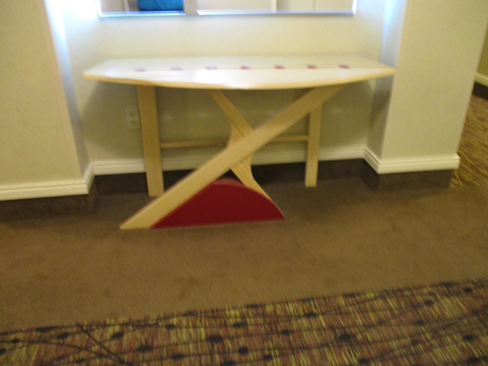
While I was initially disappointed that the same bridge would be represented on multiple floors - meaning that not all Portland bridges were included - I was interesting to see different students' takes on the same bridge. Here are three different takes on the Steel Bridge:
Each floor also had a glass engraving of a bridge photo with different facts. The first one (if you were going up from lower floors) would have the most basic facts, but then subsequent engravings would have stories and history. That could include whom the bridge was named after or times it was rebuilt. One interesting thing to see was that the busiest bridge is also the one with the most clearance, so it is the one raised the least. That is very practical, but I had never thought about it.
One nice touch was a small map on each panel showing the location of the bridge.
I appreciate the inclusion of students into the display. It added a nice three-dimensional element, but also must have been a great experience for them.
I'm afraid it is much easier to include pictures of the tables and do justice to them than it is to the pictures, and I always have some reservations about photographing photographs anyway. I do want to make a few points about them and the overall exhibit.
First of all, the engravings were a great idea. The are beautiful, but the bridges are already beautiful. However, because they look so different from the actual photos, it gives a different take on the photos, and a different way of viewing them. Challenging perception is important for any art exhibit, so helping the viewer get there is valuable, but not easy.
I think the engravings and the tables work together to accomplish that, and I believe a lot of the credit goes to exhibit curator Tess Pappas.
That was also true with the arrangement of the photos. In a superficial way it was very basic. The floor layout is in kind of a U-shape. In front of the elevator is the table and the engraving, but as you enter from either stair way there is one photo directly in front of you.
Then there are two pictures on either arm of the U, plus a larger one. (There are also bridge pictures inside the guest rooms.) The pictures that were paired in the passageways often had a kind of theme. For example, maybe there would be two showing people working, or two focusing on the cogs and gears.
Wilson has a good eye in general. Specific things that appealed to me included interesting color saturation, and also a way of focusing that while you know is representational, becomes kind of abstract. There is so much engineering and art in these bridges - functional and well-formed. It makes me wonder what he could do with Marquam - the most prosaic of the bridges.
For a nice comparison, check out the mezzanine, which has Wilson pictures of trucks, still exploring metal and engineering, but on a different scale.
http://www.photographicimage.com/A_conversation_with_Gary_Wilson.html
http://garywilsonphoto.com/home/
https://ocac.edu/
http://www.portlandparamount.com/


No comments:
Post a Comment